Free erase tool to remove objects online with AI
Powerful Object Removal
User-Friendly Interface
Time-Saving Efficiency
Remove Unwanted Objects in a Snap
Discover a powerful and innovative tool at your fingertips – Magic Eraser! Welcome to our website, where you can effortlessly erase unwanted objects from your photos with a touch of magic.
Unleash your creativity and transform your images into captivating masterpieces. Whether it’s eliminating distracting elements, erasing blemishes, or enhancing the overall composition, Magic Eraser provides a seamless editing experience that will leave you amazed.
.
Try Magic Eraser Now
Latest Articles
In today’s digital era, photographs hold immense value in capturing and preserving special moments. However, unwanted objects can often detract from the beauty and impact of these images. That’s where Clearoff comes in. Clearoff is a leading AI-powered object removal service that harnesses the potential of artificial intelligence and machine learning to effortlessly remove unwanted objects from photos. In this article, we will explore the key services offered by Clearoff, the benefits of using their AI-powered removal services, and provide a step-by-step guide on how to remove objects online with Clearoff.
Key Services Offered by Clearoff
Clearoff specializes in providing advanced AI-powered object removal services. Their cutting-edge technology allows users to easily eliminate unwanted elements from their photos, enhancing the visual appeal and storytelling capabilities of their images. Some of the key services offered by Clearoff include:
● Automatic Object Removal:
Clearoff utilizes powerful AI algorithms to automatically detect and remove objects from photos, saving users valuable time and effort.
● Precise Object Detection:
The intelligent algorithms employed by Clearoff accurately identify and highlight objects that need to be removed, ensuring a high level of precision in the editing process.
● Seamless Editing Tools:
Clearoff provides a user-friendly interface with intuitive editing tools that allow users to refine the selection and make any necessary adjustments to achieve the desired results.
● Real-Time Preview:
With Clearoff, users can preview the edited image in real-time, enabling them to make informed decisions and have full control over the final output.
● Undo and Redo Functionality:
Mistakes happen, but Clearoff has you covered. Their undo and redo functionality allows users to revert or modify edits effortlessly, ensuring a seamless editing experience.
● Batch Processing:
Clearoff offers batch processing capabilities, allowing users to upload and process multiple images simultaneously. This feature saves time and enables efficient editing of large quantities of photos.
● Selective Object Removal:
In addition to automatic object removal, Clearoff provides the option for users to manually select specific objects for removal. This level of control ensures precise editing and customization according to individual preferences.
● Background Replacement:
Clearoff goes beyond object removal and offers the ability to replace backgrounds in photos. Users can effortlessly replace a distracting or undesirable background with a more suitable one, enhancing the overall composition of the image.
● Image Retouching:
Clearoff’s advanced algorithms can assist with image retouching, allowing users to enhance specific areas of a photo. Whether it’s smoothing skin, reducing wrinkles, or adjusting colors, Clearoff’s retouching capabilities provide an all-in-one solution for enhancing image aesthetics.
● Customizable Editing Options:
Clearoff understands that every photo is unique, and users may have specific requirements. To accommodate this, Clearoff offers customizable editing options, enabling users to fine-tune the object removal process based on their preferences and creative vision.
Use Cases: Where Clearoff Shines
Clearoff caters to a wide range of use cases where object removal is essential. Here are a few examples of scenarios where Clearoff’s services prove to be highly valuable:
1. Portrait Photography
In portrait photography, capturing the essence and beauty of the subject is of utmost importance. However, distracting elements such as people in the background or other objects can detract from the focus on the main subject. Clearoff’s AI-powered object removal services enable photographers to remove these unwanted elements, ensuring the subject remains the center of attention.
2. E-Commerce Product Images
In the competitive world of e-commerce, product images play a crucial role in attracting customers. Clearoff’s object removal capabilities come in handy when you need to remove logos, watermarks, or other unwanted branding elements from product images, allowing your products to shine without distractions.
3. Travel and Landscape Photography
While capturing breathtaking landscapes and travel destinations, it’s not uncommon for tourists or unwanted objects to appear in the frame. Clearoff simplifies the process of removing these distractions, allowing photographers to showcase the beauty of the scenery without any hindrances.
4. Real Estate Photography
In the world of real estate, visually appealing property images are crucial for attracting potential buyers. Clearoff can help remove unwanted objects such as vehicles, pedestrians, or unsightly elements from property photos, allowing the focus to be on the property’s features and aesthetics.
5. Event Photography
Event photographers often encounter challenges like unwanted spectators, signage, or other distractions that can hinder the quality of their shots. Clearoff provides a convenient solution to remove these unwanted objects, ensuring that the event photos capture the true essence and atmosphere of the occasion.
6. Restoration of Old Photographs
Preserving family history is important, and old photographs hold sentimental value. However, over time, these photos can deteriorate or have unwanted marks and scratches. Clearoff’s object removal services can help restore these photos by eliminating scratches, blemishes, or unwanted elements, allowing you to cherish and share those memories for generations to come.
7. Advertising and Marketing Campaigns
Creating visually compelling advertising and marketing campaigns often involves combining multiple elements into a cohesive composition. Clearoff enables marketers and advertisers to seamlessly remove any unwanted elements that may disrupt the messaging or detract from the focal point, ensuring that the campaign delivers maximum impact.
8. Social Media Influencers
For social media influencers, maintaining an aesthetically pleasing feed is essential for engaging their audience. Clearoff assists influencers by removing any unwanted objects or distractions from their photos, allowing them to curate a visually cohesive and captivating Instagram feed or social media presence.
9. Product Packaging Design
Clearoff can be instrumental in product packaging design. Designers can use Clearoff to remove unwanted logos, labels, or background elements from product images, enabling them to create clean and professional packaging designs that highlight the product itself.
By incorporating Clearoff’s AI-powered object removal services into these use cases, individuals and businesses can elevate the visual impact of their photographs, improve brand perception, and create stunning visuals that effectively communicate their message to the target audience.
Benefits of Using Clearoff’s AI Removal Services
By choosing Clearoff for object removal, users can enjoy a range of benefits:
1. Time Efficiency:
Clearoff’s AI-powered algorithms automate the object removal process, significantly reducing the time required for manual editing. With Clearoff, you can achieve professional-quality results in a fraction of the time.
2. Superior Accuracy:
The advanced AI algorithms employed by Clearoff ensure precise object detection and removal, resulting in high-quality and natural-looking images without any remnants of the removed objects.
3. User-Friendly Interface:
Clearoff’s user-friendly interface and intuitive editing tools make the object removal process a breeze, even for those with limited editing experience. With Clearoff, anyone can achieve outstanding results.
4. Cost-effectiveness:
Cost-effectiveness and user satisfaction go hand in hand. By using Clearoff’s AI removal services, you eliminate the need to invest in expensive software or hire professional editors. Clearoff offers a cost-effective solution that delivers exceptional results, making it an ideal choice for individuals and businesses alike.
5. Versatility:
Clearoff caters to a wide range of industries and purposes. Whether you’re a photographer, e-commerce store owner, social media influencer, or someone who simply wants to enhance their personal photos, Clearoff’s AI removal services can be tailored to meet your specific needs.
6. Preserve Image Quality:
Traditional manual editing methods often lead to a loss in image quality due to extensive cloning and retouching. With Clearoff, you can maintain the original quality of your images while seamlessly removing unwanted objects. The advanced algorithms ensure that the final result blends naturally with the rest of the photo.
7. Increased Productivity:
By automating the object removal process, Clearoff significantly boosts productivity. Users can edit a large number of photos in a shorter amount of time, allowing them to focus on other important tasks or creative endeavors.
8. Mobile-Friendly Solution:
Clearoff offers a mobile-friendly platform, allowing users to access and utilize its object removal services directly from their smartphones or tablets. This flexibility enables on-the-go editing and caters to the needs of mobile photographers or social media enthusiasts.
9. Advanced Editing Capabilities:
Clearoff’s AI algorithms not only remove objects seamlessly but also handle complex editing tasks such as perspective correction, image resizing, or image enhancement. This comprehensive set of editing capabilities provides users with a one-stop solution for all their editing needs.
10. Collaboration and Sharing:
Clearoff simplifies collaboration and sharing of edited photos. Users can easily share the edited images with clients, colleagues, or friends, streamlining the feedback and approval process for projects or personal endeavors.
11. Affordable Editing Solution:
Clearoff offers affordable pricing plans, making professional-level object removal accessible to a wide range of users. Whether you’re a professional photographer or an enthusiast, Clearoff’s cost-effective solution allows you to achieve remarkable results without breaking the bank.
How to Remove Objects Online with Clearoff?
Using Clearoff to remove objects from your photos is a straightforward process. Follow these simple steps to achieve remarkable results:
Step 1: Visit the Clearoff Website
Navigate to the Clearoff website using your preferred web browser. You’ll be greeted with a user-friendly interface that’s designed to make your editing experience smooth and efficient.
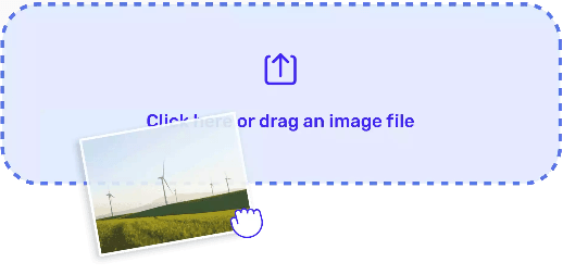
Step 2: Upload Your Photo
Click on the “Upload” button and select the photo from which you want to remove objects. Clearoff supports various image formats, ensuring compatibility with your photos.
Step 3: Automatic Object Detection
Once your photo is uploaded, Clearoff’s advanced AI algorithms will automatically detect the objects present in the image. You’ll see a precise outline around the objects that are identified for removal.
Step 4: Refine the Selection (Optional)
If needed, you can refine the selection by using Clearoff’s editing tools. These tools allow you to adjust the selection boundaries and ensure that the desired objects are accurately chosen for removal.
Step 5: Preview and Finalize
Clearoff provides a real-time preview of the edited image. Take a moment to review the result and make any necessary adjustments. Once you’re satisfied, click on the “Apply” or “Save” button to generate the final edited image.
Step 6: Download and Share
After the editing process is complete, you can download the edited image to your device. Share it on social media, use it for professional purposes, or cherish it as a beautifully enhanced personal memory.
With Clearoff’s AI-powered object removal services, you can effortlessly transform your photos into visually captivating masterpieces. Unlock the potential of your images by visiting Clearoff’s website and experiencing the convenience, accuracy, and cost-effectiveness of their services. Don’t let unwanted objects hinder your visual storytelling—choose Clearoff for seamless object removal today.
FAQs
Is there a limit to the file size or resolution of the photos that Clearoff can handle?
Clearoff is designed to handle photos of various sizes and resolutions. While there may be practical limitations based on internet speed and processing time, Clearoff supports high-resolution images and strives to accommodate a wide range of file sizes.
Can Clearoff remove objects from videos or is it limited to static images?
Currently, Clearoff specializes in object removal from static images and does not offer video editing capabilities. However, it’s worth noting that Clearoff’s services can be applied to individual frames extracted from videos.
Does Clearoff support multiple languages for its user interface and object detection?
Currently, Clearoff’s user interface is available in English, but its object detection capabilities can handle images with various languages and text. Clearoff’s advanced AI algorithms can detect and accurately remove objects regardless of the language used in the photo.
Can I use Clearoff for commercial projects that involve copyrighted images?
Clearoff’s services are intended for legal and ethical use. When using copyrighted images, it’s important to ensure that you have the necessary rights or permissions to edit and distribute those images. Clearoff assumes that users have obtained the required authorizations for any copyrighted content.
Does Clearoff store the edited photos on its servers?
Clearoff values user privacy and data security. Edited photos are stored temporarily on their servers to ensure a smooth editing experience, but they are deleted after a certain period. Clearoff does not retain or use edited photos for any other purposes.
Can Clearoff remove specific types of objects, such as watermarks or logos?
Yes, Clearoff’s AI algorithms can effectively remove various types of objects, including watermarks, logos, or text overlays. By accurately detecting and analyzing the objects in the photo, Clearoff ensures precise removal while maintaining the integrity of the image.
Does Clearoff offer a satisfaction guarantee or refund policy?
Clearoff is committed to customer satisfaction. If you encounter any issues or are unsatisfied with the results, Clearoff’s support team is available to address your concerns. Refund policies may vary, so it’s recommended to review Clearoff’s terms and conditions or reach out to their support team for specific details.
Join our monthly newsletter
Receive exclusive offers and discounts by joining our email list.